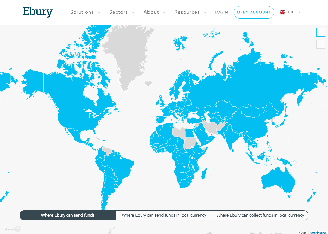
Recently, we have built out a cool interactive map displaying the payments and capabilities coverage of Ebury for our corporate website using CARTO.
We will walk you through all the stages of development that we made and point you at the source code of our project GitHub.
By applying the micro-services philosophy, we decided to develop it in a separate project, so we began to analyse the tech stack to be used.
We took a look at tools like Google Maps or Leaflet, which are great for displaying maps, but it was not easy to display the data in the way we wanted. We then played around with D3.js, a great library for visualising data. However, it was not straightforward to implement a map with standard controls such as zoom or the drag feature.
Finally, we found CARTO that offered the best functions out of all of the options which made it super easy to create this map.
Adding the data to CARTO
First of all, we needed to have an account with CARTO. This is something that you can do for free via their webpage.
After that, we were able to see our dashboard, with a menu where we can access the two main sections: maps or datasets.
As we needed more customisation in our map than the one that CARTO provides (like custom styles in the tooltips and models), we decided to work solely with datasets and visualise the map later with their JavaScript library.
We separated the data into two datasets. The first is the one that contains the information about the countries (names, geography). We used the data provided by CARTO from their data library (World Borders).

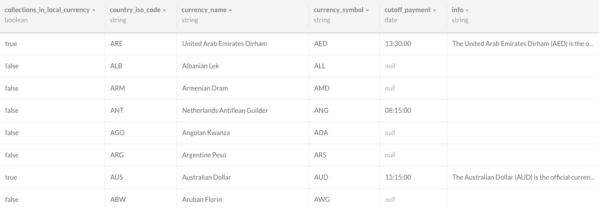
We then created a new dataset with the information about our payments and capabilities coverage. We used a CSV to create this dataset.

And that’s it, we already have all the data we need (split into two different datasets which we can join as we’ll see below), so now it’s time for coding!
Creating the map
This is going to be a pure front-end application, so all we need is HTML, CSS and JS.
The HTML that we need is going to be very easy: we just need a container for the map.
<div class="js-map map"></div>
As we want to have the map displayed in full screen, we have to style that container.
.map {
  position: absolute;
  top: 0;
  right: 0;
  left: 0;
  bottom: 0;
  background-color: #F7F7F7;
}
Now, we can start working on the JS code that will render the map. We need the official CARTO JavaScript library: CARTO.js. It has a nice format and it’s very easy to use.
This library has already integrated Leaflet, so we don’t need to include it separately.
class PaymentsCapabilitiesMap {
  constructor() {
    this.options = {
      center: [30, 0],
      zoom: 3
    }
    this.container = document.querySelector('.js-map');
    this.query = `
      SELECT payments_and_capabilities.*, world_borders.the_geom_webmercator, world_borders.the_geom
      FROM payments_and_capabilities
      LEFT JOIN world_borders AS world_borders
        ON world_borders.iso_a3=payments_and_capabilities.country_iso_code;
    `;
    this.cartocss = `
      #world_borders {
        polygon-fill: #00BEF0;
        polygon-opacity: 1;
        line-color: #FFF;
        line-width: 0.5;
        line-opacity: 1;
      }
    `;

    this.createMap();
    this.addCartoLayer();
  }

  createMap() {
    this.map = new L.Map(this.container, {
      center: this.options.center,
      zoom: this.options.zoom,
      minZoom: this.options.zoom,
      zoomControl: false,
      scrollWheelZoom: false,
      attributionControl: false
    });
  }

  addCartoLayer() {
    cartodb.createLayer(this.map, {
      user_name: 'ebury',
      type: 'cartodb',
      sublayers: [{
        sql: this.query,
        cartocss: this.cartocss,
      }],
    }, {
      https: true
    })
      .addTo(this.map);
  }
}

let map = new PaymentsCapabilitiesMap();
The most important part of the code above is the query we use to retrieve the data from the two datasets that we created before, which we join with a LEFT JOIN SQL statement.
CARTO also provides an easy way for styling our map thanks to CartoCSS. We use it to change the colours of our polygons.
However, this map is not currently very useful, as we are just displaying countries. Let’s add some interactivity.
Filtering the displayed data
Our map should display the countries belonging to one of the three categories: where Ebury can send funds, where Ebury can send funds in local currency, and where Ebury can collect funds in local currency.
So, first of all, let’s add some controls to the HTML, so the user can select a category (the default one will be ‘Where Ebury can send funds’).
<div class="categories">
  <div class="btn-group btn-group-justified" data-toggle="buttons">
    <label class="btn active">
      <input type="radio" name="category" class="js-category" checked value="payments"> Where Ebury can send funds
    </label>
    <label class="btn btn-primary">
      <input type="radio" name="category" class="js-category" value="payments_in_local_currency"> Where Ebury can send funds in local currency
    </label>
    <label class="btn btn-primary">
      <input type="radio" name="category" class="js-category" value="collections_in_local_currency"> Where Ebury can collect funds in local currency
    </label>
  </div>
</div>
Now we have to change our JS code slightly. We’ll change the applied CartoCSS, so all the countries not belonging to the selected category will be displayed in grey and the ones belonging to it will be displayed in blue.
Hence, we have to add/modify the following in the constructor of the class:
this.category = 'payments';
this.cartocss = `
  #world_borders {
    polygon-fill: #D9D9D9;
    polygon-opacity: 1;
    line-color: #FFF;
    line-width: 0.5;
    line-opacity: 1;
  }

  #world_borders[{{ category }}=true] {
    polygon-fill: #00BEF0;
  }
`;
We also have to change the addCartoLayer method in order to apply the appropriate CartoCSS for the selected category:
addCartoLayer() {
    cartodb.createLayer(this.map, {
      user_name: 'ebury',
      type: 'cartodb',
      sublayers: [{
        sql: this.query,
        cartocss: this.cartocss.replace('{{ category }}', this.category)
      }],
    }, {
      https: true
    })
      .addTo(this.map)
      .on('done', layer => {
        this.cartoLayer = layer.getSubLayer(0);
      });
}
And finally, we include new methods for handling the change of the category when the user clicks in one of the category buttons:
handleCategoryChange() {
  $('.js-category')
    .on('change', e => this.changeCategory($(e.currentTarget).val()));
}

changeCategory(category) {
  this.category = category;
  this.cartoLayer.setCartoCSS(this.cartocss.replace('{{ category }}', this.category));
}
The new method handleCategoryChange has to be executed in the constructor, after creating the Carto layer.
And with this, we have now a map that will display the countries according to the selected category.
Check out our application
Apart from displaying the countries depending on the category, we also added more functionality such as displaying tooltips when hovering over a country and displaying a modal with extra information when clicking a country.
You can check how we did it in our GitHub repository or you can interact with out map live here.
We hope this has been useful for you to begin visualising your geographical data with CARTO in an easy way.

