How to build a design language that works across teams and platforms
Invision acquired Brand.ai, UXPin released Systems, and Uber, IBM, and Salesforce are examples of companies who have decided to change the way of designing digital products.
They all have one thing in common: using Design Systems as a way of creating outstanding user experiences.
A Design System is more than a style guide and a 2017 trend. It is the foundation of the design language in order to build consistent, convenient and scalable tech products. However, adopting a design system that also considers user requirements means choosing a clear strategy to avoid the risk of never getting things done.
How we’ve built the Ebury Chameleon Design System
Evolution vs Revolution
At Ebury the conversation began by bringing together Designers, Front-end Developers, Leaders and the Product Team involved. We could not afford to wait to have the perfect system before releasing it, so we have taken an evolving approach to ensure we can carry out optimisations and code refactor efficiently.
Design Principles
One of the initial steps we took was to identify the Design Principles that will guide the process. After performing some user research in order to identify the key pain points of our app, we defined the principles that better frame what we want to achieve with the implementation of the Design System:
Secure
Design must help us understand any financial information. Its primary goals are to reduce ambiguity, provide consistency, and use the proper metaphor for each piece of information.
Time-saving
Users have clear goals when using our platform, and we should be able to let them find what they need straight away. The design must allow quick and well-connected navigation as well as an efficient performance for both the client and the server.
Peace of mind
Our platform is there to help the user. The design is developed in order to reduce information density, allowing users to dig into data as they need it. We encourage interaction over static and crowded data display.
Tailor made
Personalisation is one of the key features that the creation of the design system relies on. We have to avoid making closed decisions that don’t allow users to adapt the brand or format to their specific needs and culture.
A System Design
Voice and tone
Our users are managing operations around the world and this implies many different situations where we have to communicate our messaging properly. We have defined some basic rules in order to write appropriate and convenient UI messages and to label our components. Similarly, every component is adapted to the language and culture so we can adapt to the user context easily.
8-point grid system
We decided to follow the 8-point grid system proposed by Bryn Jackson and built the layout system based on this. The grid definition allows us to find the perfect balance between alignment and proportions as well as to reach pixel perfection at different resolution sizes.
Typography
‘Roboto’ is the main family we’ve integrated to optimise the display view. We’ve also taken its variation ‘Roboto Condensed’ when it comes to representing numerical values on data tables, which gives us a neat text format.
Icons
We use system icons from the Material Design library to represent standard concepts across applications. Any newly-generated icon is created with the same design principles.
Icons are not only used to communicate a piece of information visually, but also to represent actions that will help the user to work more efficiently. Icons, shapes and colours are combined in order to allow our customers to understand what’s going on at any time.
Colour

There are different ways of creating colour schemes for a website or an app. At Ebury we’ve chosen a monochromatic scheme approach for several reasons:
- To simplify interactive elements and their affordance as well as reserve complementary colours for important elements
- To define an automatic system of variations based on the hue with full control of the final look and feel
- To set up an easy definition of it on a SASS or LESS file and change it dynamically
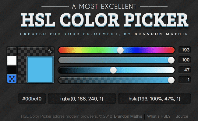
The colour palette is defined using HSL representation. This allows us to play with Hue, Saturation and Luminosity values in order to build the colour system.
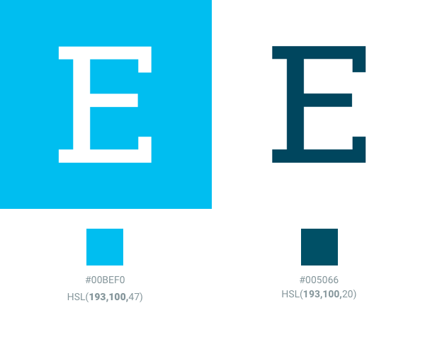
Based on our Key Colour ‘Tech Blue’ defined in RGB #00BEF0 we have obtained the HSL equivalent HSL(193,100,47) and created the accent colour HSL(193,100,20).
// Main brand colors
$main: #00BEF0 !default;
$main-h: hue($main);
$main-s: saturation($main);
With the same Hue and Saturation simply by changing the Luminosity value we have obtained a range of values that will create the reference set of variations.
// Luminosity values
$l1: 12;
$l2: 20;
$l3: 37;
$l4: 47;
$l5: 56;
$l6: 88;
$l7: 96;

$main1: hsl($main-h, $main-s, $l1); // #00313d
$main2: hsl($main-h, $main-s, $l2); // #005266
$main3: hsl($main-h, $main-s, $l3); // #0097bd
$main4: hsl($main-h, $main-s, $l4); // #00c0f0
$main5: hsl($main-h, $main-s, $l5); // #1fd2ff
$main6: hsl($main-h, $main-s, $l6); // #c2f3ff
$main7: hsl($main-h, $main-s, $l7); // #ebfbff
Since we needed to have a neutral colour palette for other UI elements such as borders, backgrounds, shadows, etc., we’ve reduced the amount of tint of the main colour palette to obtain a greyish scale. Following a similar process, we have achieved a less saturated palette with equal luminosity and a subtle tone of the original blue (hue is kept to 193, but saturation is set at 10).
// Grayscale colors
$gray-h: $main-h;
$gray-s: 10;

$gray1: hsl($gray-h, $gray-s, $l1);
$gray2: hsl($gray-h, $gray-s, $l2);
$gray3: hsl($gray-h, $gray-s, $l3);
$gray4: hsl($gray-h, $gray-s, $l4);
$gray5: hsl($gray-h, $gray-s, $l5);
$gray6: hsl($gray-h, $gray-s, $l6);
$gray7: hsl($gray-h, $gray-s, $l7);
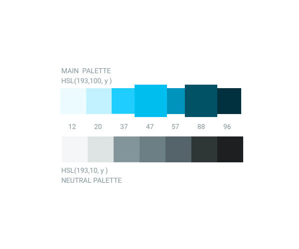
With these two palettes we have total freedom to create and build components and also generate new palettes for specific branded products, while keeping accessibility and contrast. Only by changing the Hue value we can create new palettes that works well on screens with a similar brightness and ranges of colours.
Layout
Ebury Chameleon layout is optimised for desktop usage but responsively designed to be usable at any resolution on any device.
It is intended to allow a flexible navigation as well as keeping the main work space visible. When it comes to digging into the specific details of an item the user is shown a side panel that is accessible from a URL. The main menu is reduced for small screen sizes to keep a wider space for the content that matters.
Other considerations
There are many other things to consider when building a Design System, for example how to collaborate between team members, how the system is maintained, or which kinds of strategy we can follow to give good visibility of it to other departments.
At Ebury we have worked on defining a process that maintains our evolving system and is open for improvements and other suggestions.