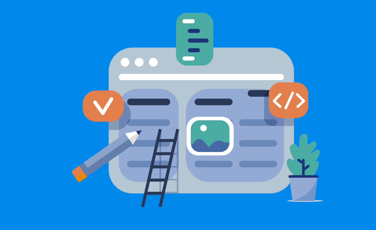
Starting a new design project is always a challenge. Even identifying what you have to do first can be difficult.
The design process is not always clear, normally because each project has its owns requirements, platforms, devices, deadlines, etc. Bearing that in mind, you can’t follow the same design process each time and sometimes you’ll have to modify your approach, adapting to your current project.
Understand the problem
These are some general recommendations when starting a design project but as I said this can, and often should, change depending on the task.
Design is about solving problems and you should identify the main problem you are trying to solve. It seems so obvious but you should apply this idea to all sorts projects.
For example:
You are designing a mobile application to read newsletters and feeds. What is the main problem you want to solve?
Maybe finding the right news piece is difficult for your users as they have a long list of news items and they can’t find what they want quickly. If this is the main problem your design should be focused on the categories and a suitable search system.
The first thing to know about design is that it is progressive work. There is a basic difference between offline and online projects in terms of continuity. Your online project never will be finished. You are continuously receiving feedback and applying new improvements. In conclusion, solving new problems.
Before you create the design you should have as much information as possible and have in mind all project requirements and constrains. If you don’t do this at the start, you could spend a lot of time working on it only for the result to not completely solve the problem.
You should ask the right questions:
- Target – Who is the design going to be used by? (Age, gender, country, etc.)
- Platform – What platform or devices will support your design? Is it cross-platform?
- Content – What type of content will be included in the project? What is the most relevant information for the audience? (Images, text, forms, video, etc.)
- Features – What functionalities will support the project? Do you need to bear in mind other UI components for specific features? (Eg. drag and drop areas).
There is a basic difference between offline and online projects in terms of continuity. Your online project never will be finished.
Get inspired
Your next steps should focus on creating a look and feel according to the information you’ve collected.
If your project is oriented around children, for example, you would need to consider including vivid colours, illustrations and big UI elements.
There’s a lot of details that can be applied to your design depending on the people that your project is orientated around. Because of that, you need some references from live projects before you start your design. It’s really important to get inspiration for new projects so you can become aware of trends.
For me, a good inspiration method is creating mood boards. A mood board is basically a collection of images based on a specific concept. You can create digital mood boards or even offline mood boards with objects like fabric, paintings, paper, etc. It’s like creating a collage aligned with the style that you want to apply to your project.
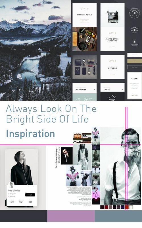
To create your own mood board you can take screenshots from websites you consider align with the feeling that you are searching for in your project. Maybe you like the colour palette used on a website, photography or a poster you see on a wall in the street. Your mood board can become a playground where you try different things and find the best combination of elements.
However, it’s important to bear in mind that your selected images may be subject to copyright. The purpose of the mood board is to get inspiration, not just copy.
When you feel comfortable with your mood board, it’s time to go forward and define your design.
Use atomic design for UI projects
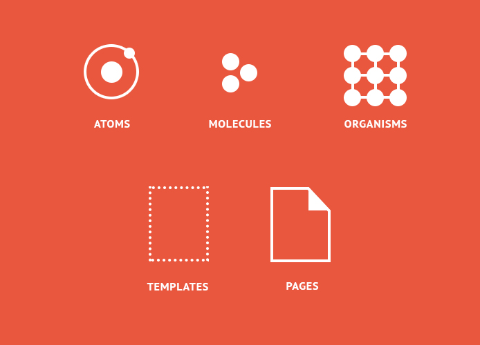
Atomic design is a concept based on the management of small parts and how we can arrange them to create complex designs.
In this case, we are using the atomic design in terms of design and style but it can be also be applied to coding. This concept will help us to create UI that pays attention to small details and defines them properly before building complex designs.
There are frameworks and libraries that use this concept to manage small UI components and provide modularity for projects. Bootstrap is a good example of framework based on this concept.
The elements of atomic design are:
- Atoms – Colour, typography, buttons, labels, icons etc.
- Molecules – Tables, lists, form fields, menus, messages, alerts etc.
- Organisms – Headers, footers, comments, forms etc.
- Templates – The layouts you need for your design.
- Pages – Final pages like home, contact page, photo gallery etc.
Start with atoms and continue with molecules, organisms etc. You should organise your designs in order to keep reference of all elements (atoms, molecules and organisms), so it’s a good idea to create a guideline document containing all these elements.
If you don’t know how to start your design, take a look to your mood board and try to define elements from there. The best way to start is defining a colour palette and typography because these are among the most basic elements of a design.
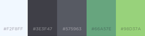
Colour palette
You can pick some colours from your mood board and add others if you need.
I usually select the background colours and text colours first, so I can make sure text is easy to read on each background. I also pick a secondary colour for alternative texts.
You can use Lorem ipsum as placeholder text with a common font-face like Arial to check the colours.
My last selection is the primary brand colour and other alternative brand colours. Sometimes you won’t need more than five colours but, depending on how you intend to use them, you may need light and dark variations. Coolors.co is an useful tool to create colour palettes.
Typography
The next step is choose the font-face you want to use for your site. A useful tip is create a list with different uses and sizes for the text like headings, body text, small text, links, blockquotes etc. Probably you’ll want to choose different font-faces or font-weights depending of the use case, so include all variations in your document.
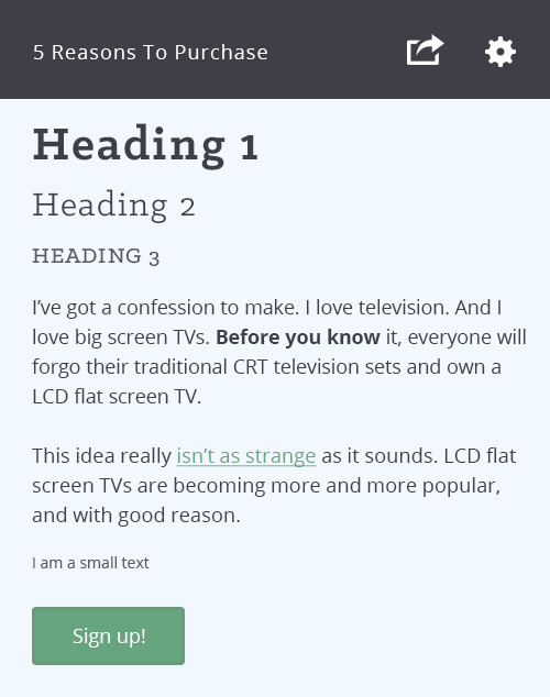
As you can see in the image below, it is possible to create a simple design using your atomic elements to test colour and typography. From this composition you can easily move to complex designs and create your guidelines.
In conclusion, there are many ways to start a design project but most people should be able to get results by following these simple tips. To take your design to the next level you’ll need some knowledge of graphic composition, but this is a big step.
Look out for further insight in follow-up design articles.
I hope this article helps you with your design projects!